Cuphead Website
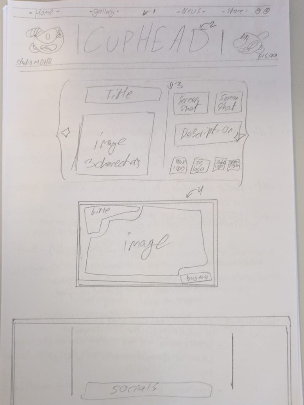
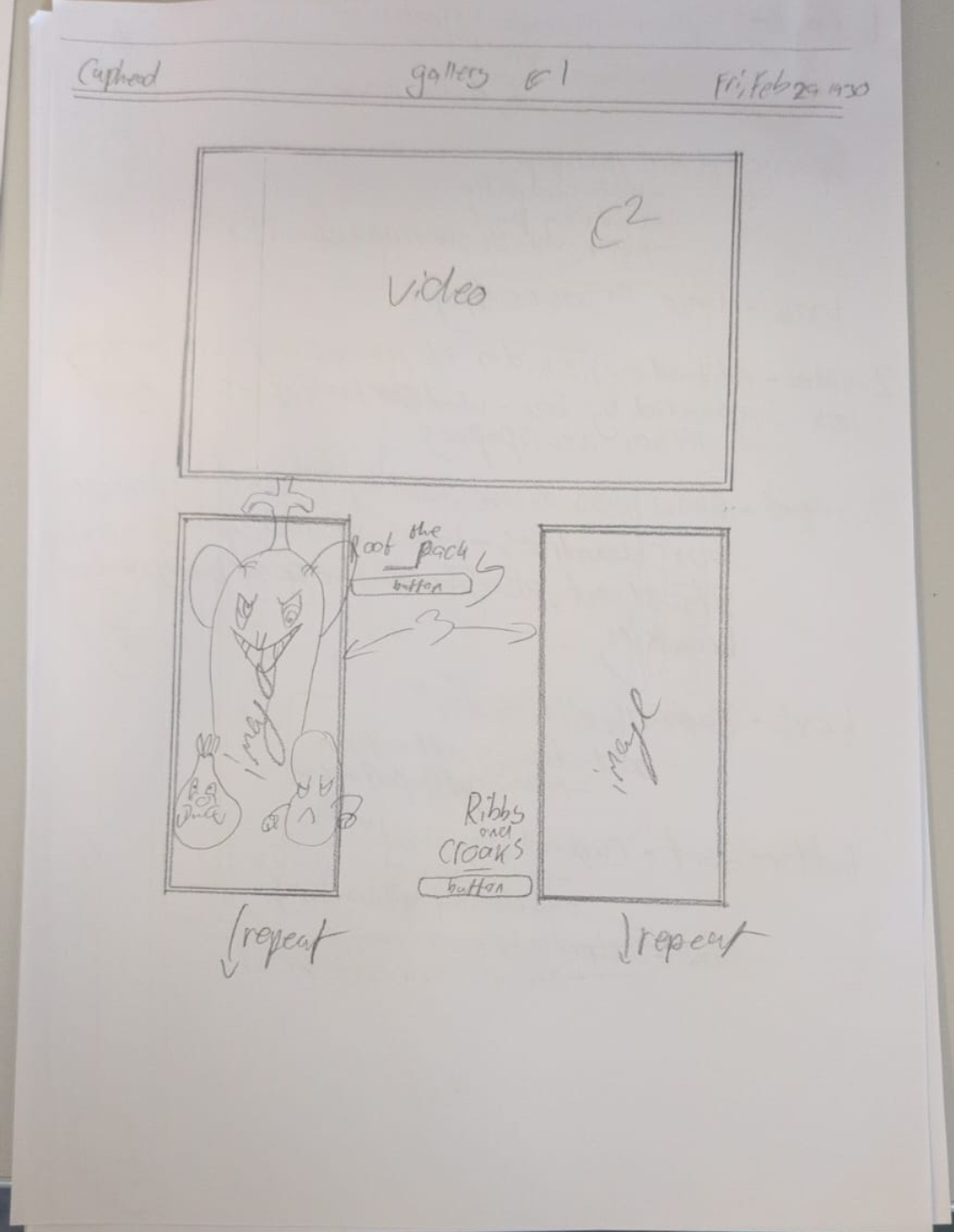
This website was made for a sixth form project. prompted by "a website focusing on music" I chose to make one on the game "Cuphead" that I was playing at the time. For the Design I chose to focus on newspaper designs from the early 30s (a time the game was heavily inspired by), using text faces, and the newspaper design of the time with additional features only available on modern devices.
Due to the fact this website was developed in a school enviroment on "Wix" it is unable to be viewed but can be seen in available images along with development media.
A download link for the creative process is avalible below:
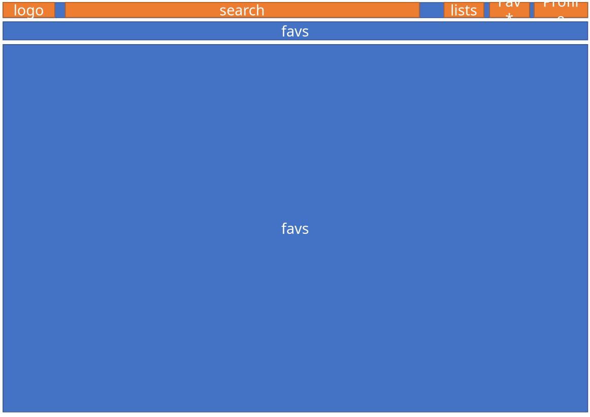
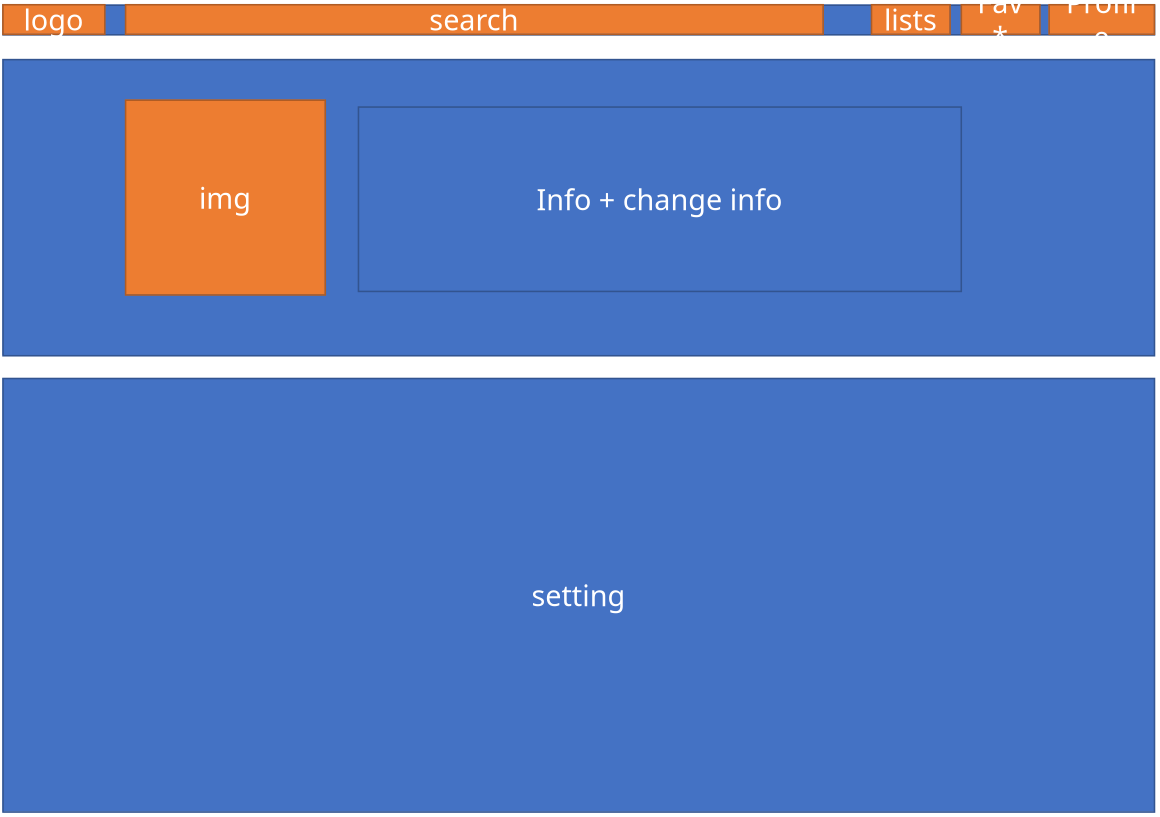
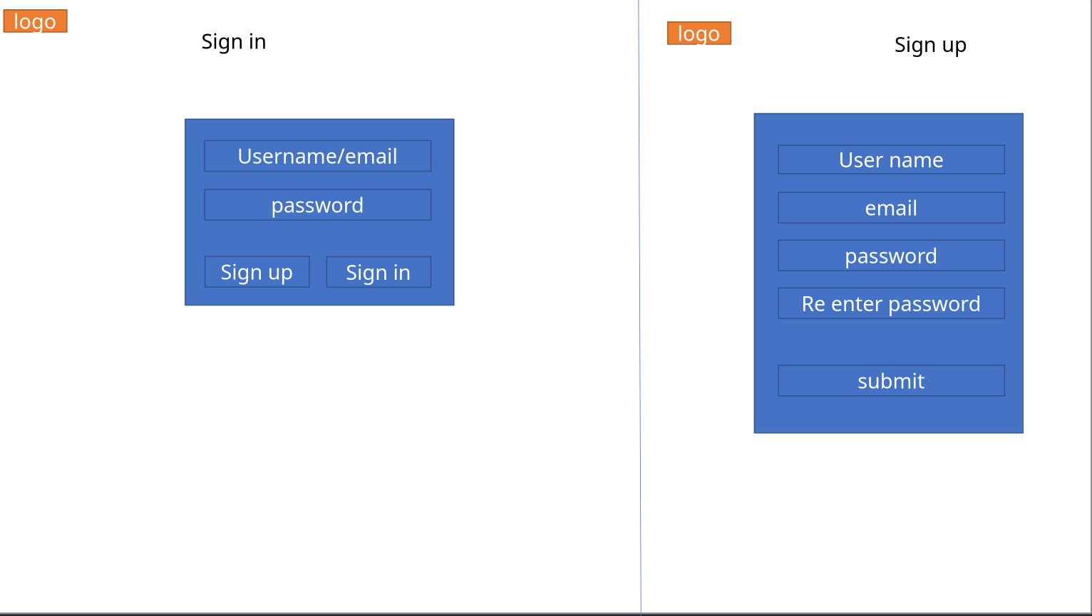
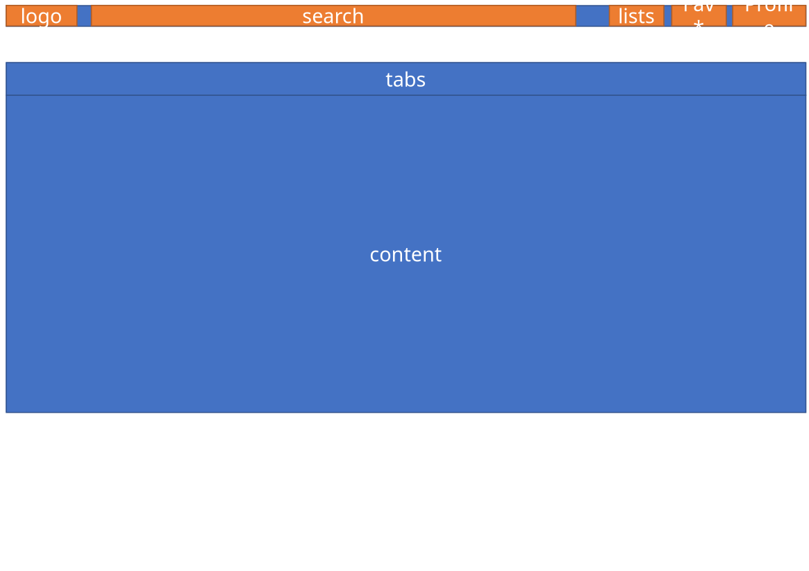
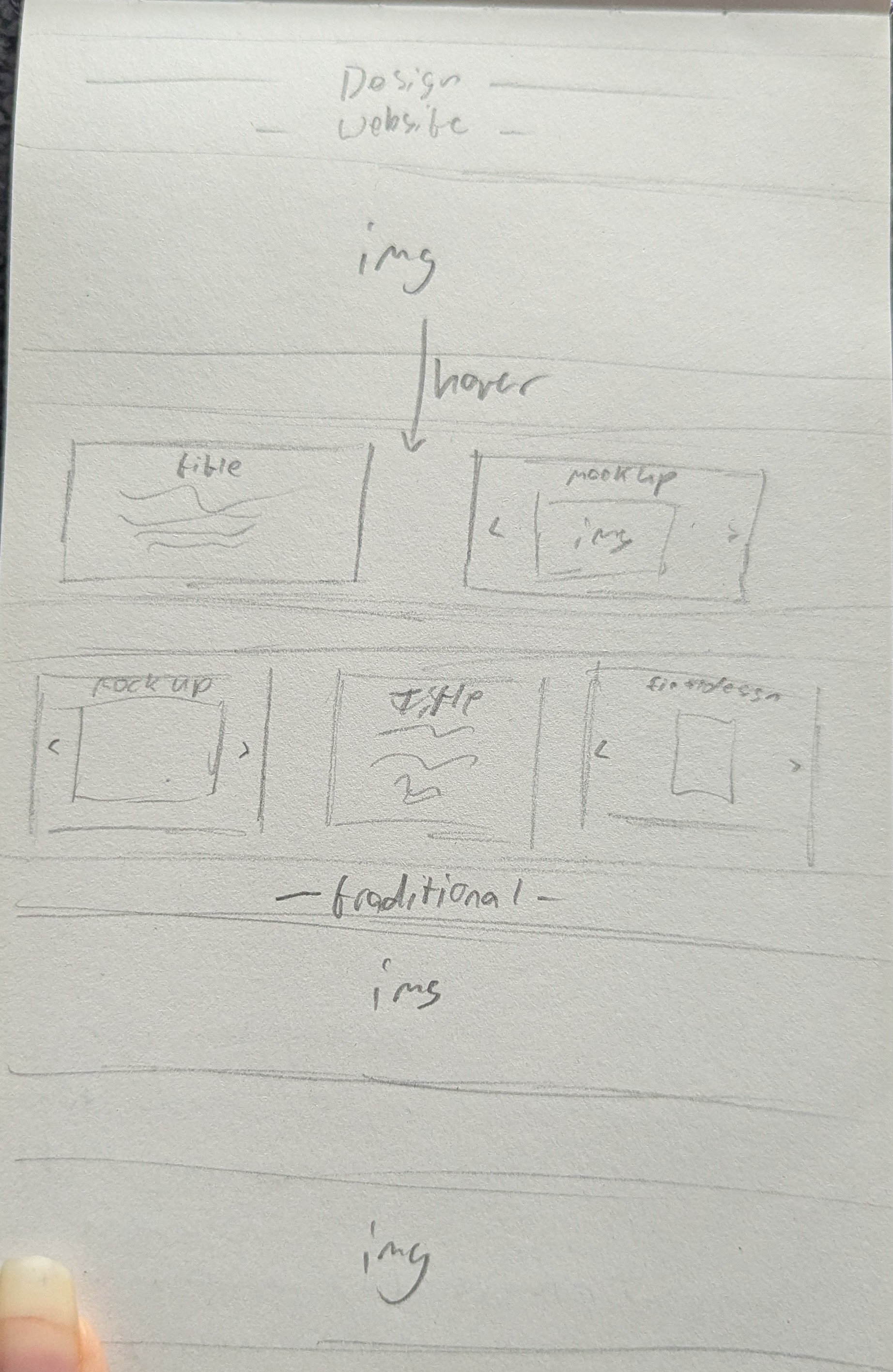
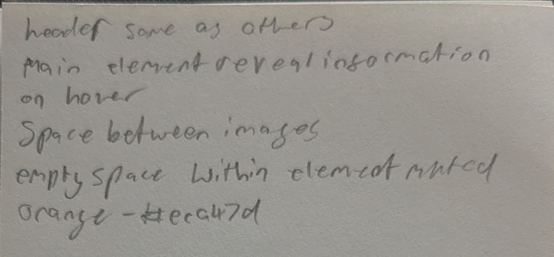
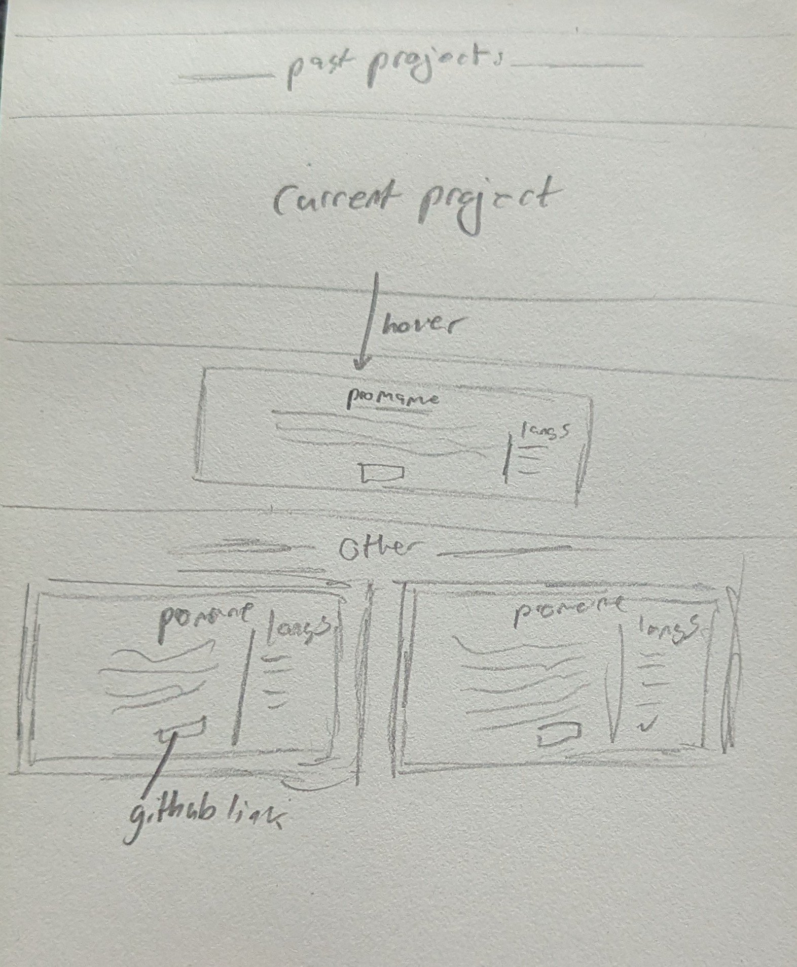
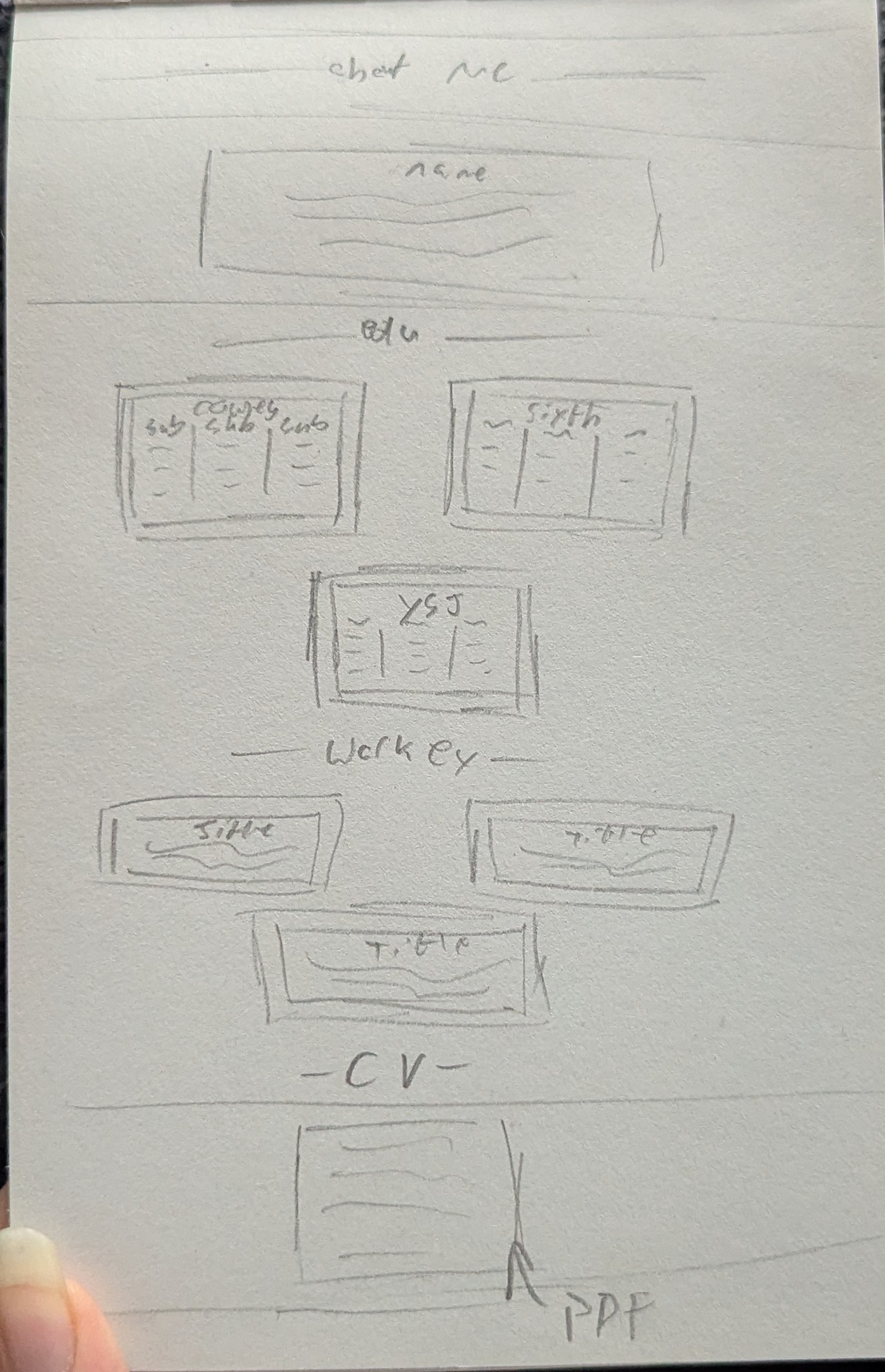
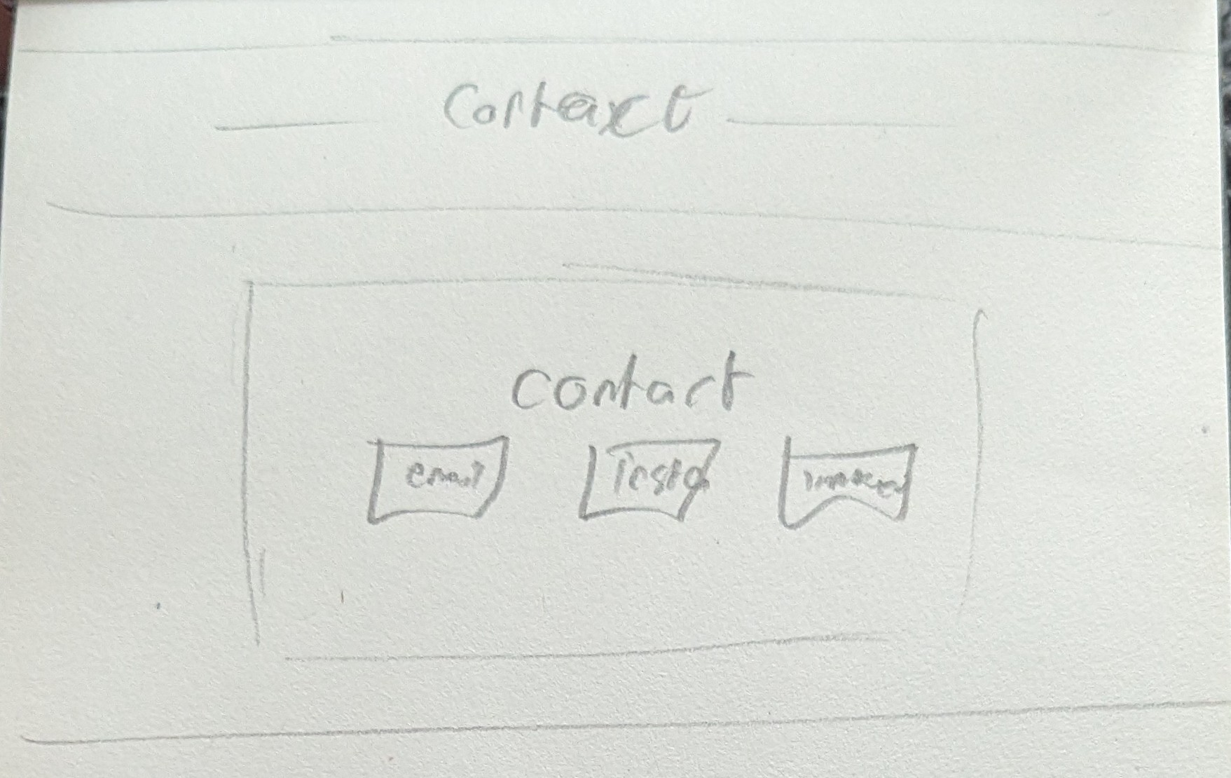
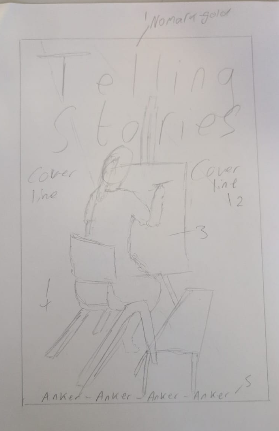
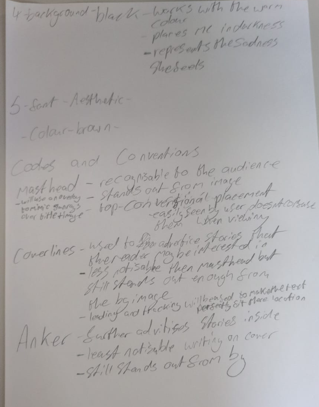
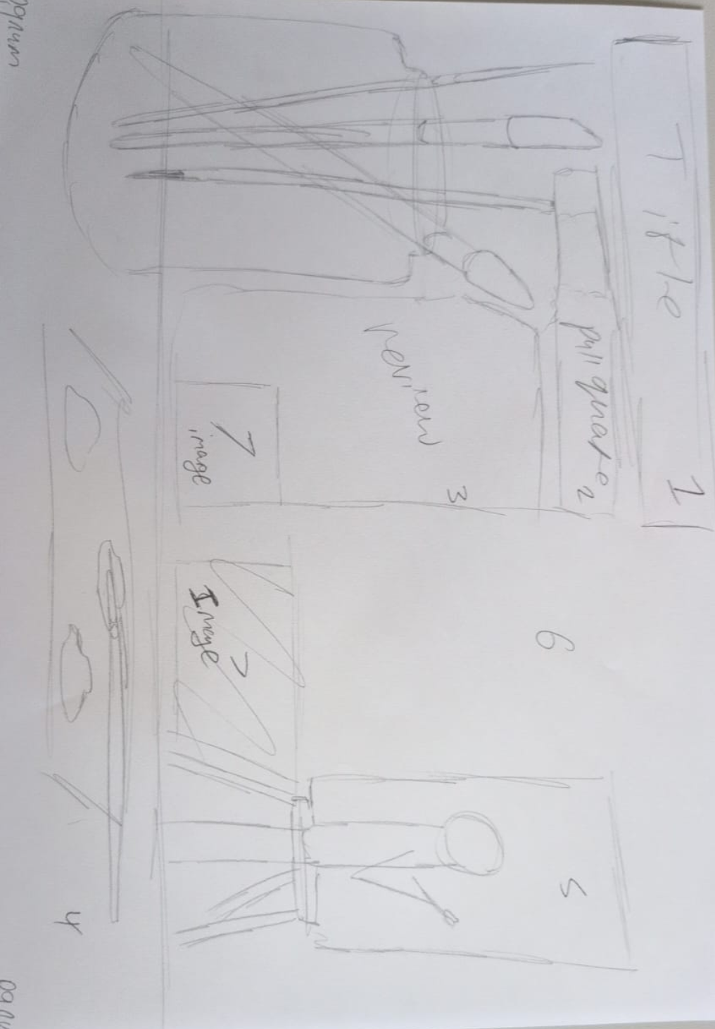
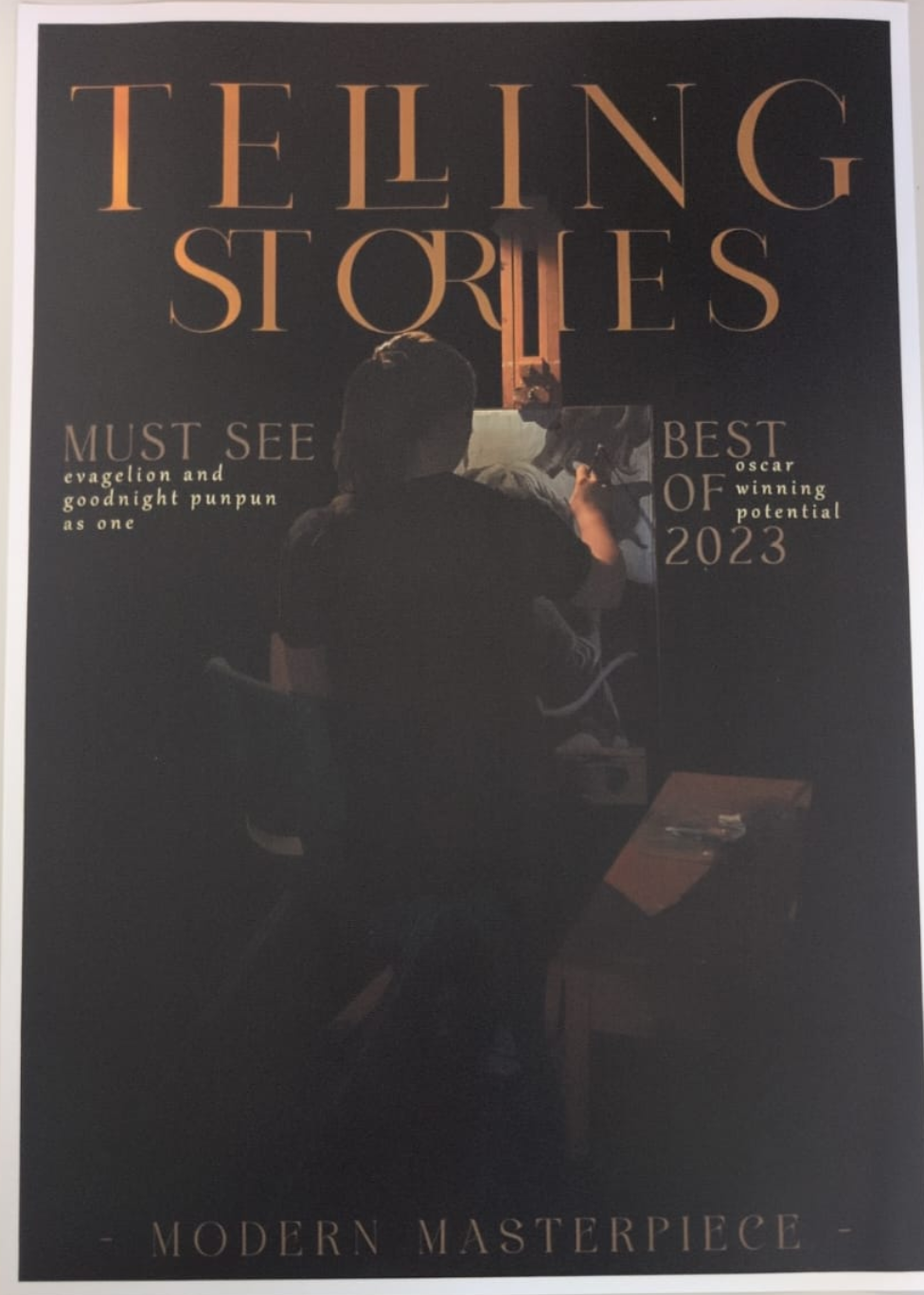
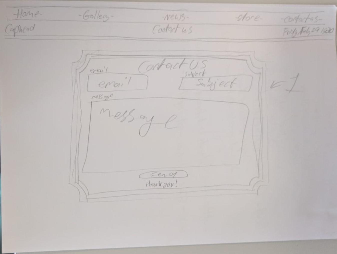
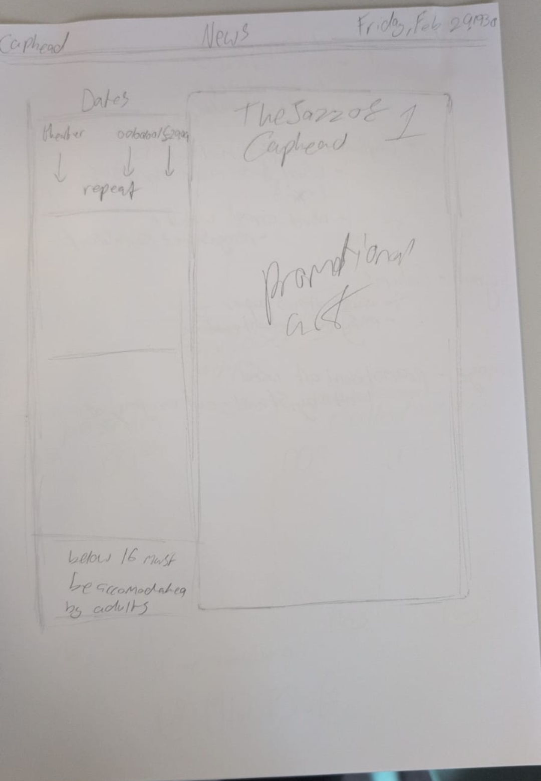
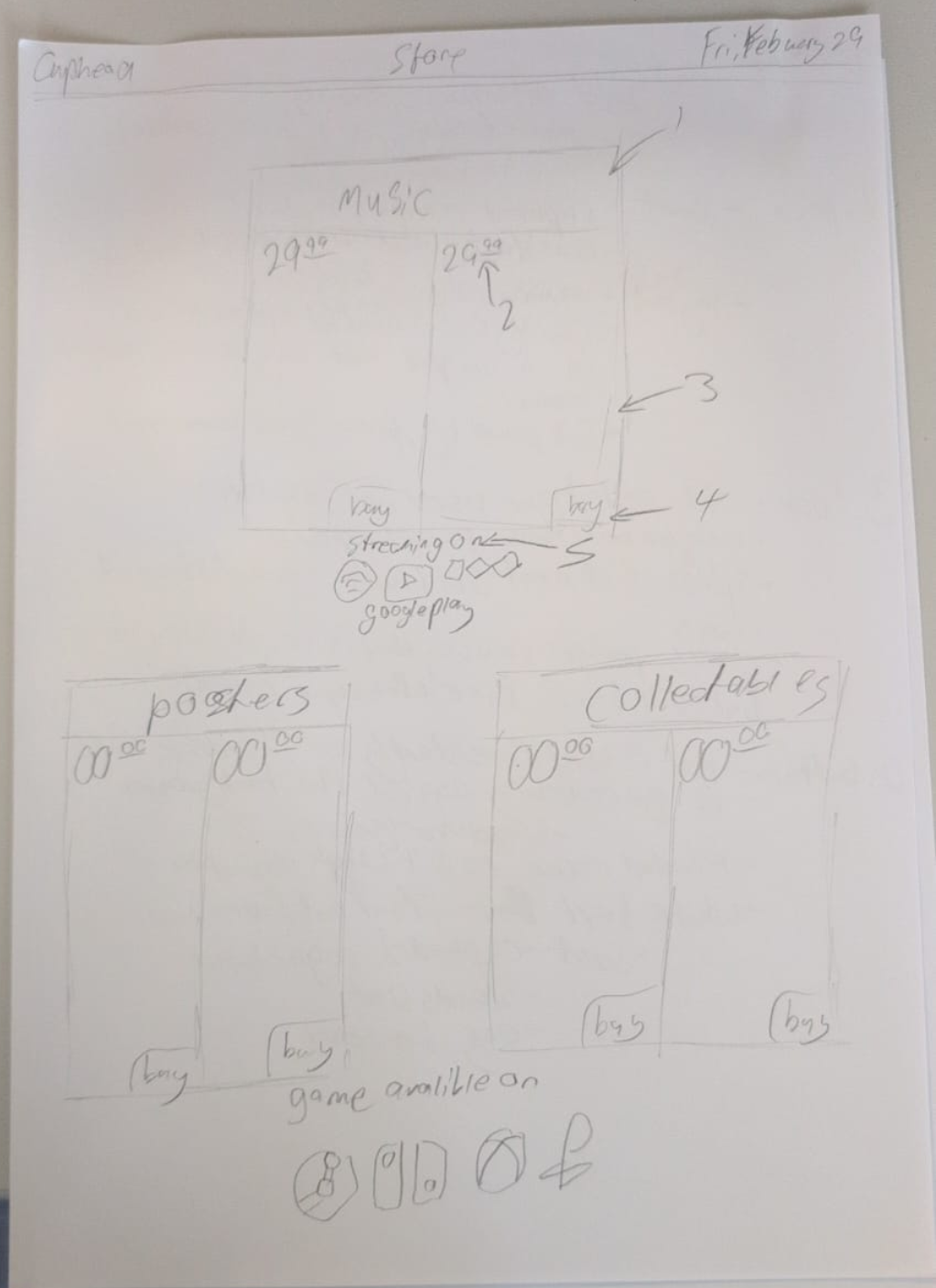
Inital Mockup